
Sneak Peek
During summer, two things happened:
- kaa-ching went to the Carribean for a 4-week vacation
- kaa-ching worked on the concepts of the new user interface for TBE.
The vacation was great, relaxed and warm. So let’s focus on the new user interface in this post.
Why a new UI?
There are two reasons for a new UI. The first one, is that we were annoyed with the current one. It looked on the original screenshots, but the pie menu just wasn’t a good concept in real life. The UI felt rather cumbersome, you needed a lot of mouse clicks to accomplish simple things. We felt we could do better.
The second reason was of a more technical kind: we wanted to switch to the latest possibilities in the Qt library. For several years now, Qt has a new programming paradigm called QML. QML promises very interactive, very responsive user interfaces - with significantly less code. Martian was already using QML at his current job, so we wanted to see if it would work out for TBE. We chose to do two small, separate tests first.
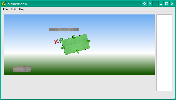
Architecture spike 1: handing objects
The first small test (a ‘spike’), was about moving/rotating/resizing objects. See github.com for the code. It’s not exactly like Inkscape or LibreOffice because we realized we had different goals. And obviously, we wanted to make it slightly more colourful: it’s a game after all.
We even implemented the basics of undo/redo - something very complex. Unfortunately, QML didn’t help us there.
We kept to Qt’s own make system, qmake. And were again nhappy with it: it doesn’t give us enough control.
Another thing we learned from this spike is that although it looked great and worked really well for users, the code was all wrong. Calculations for scaling and aspect ratio were overly complex and weren’t even fully correct. So we had to do that different in the real thing.
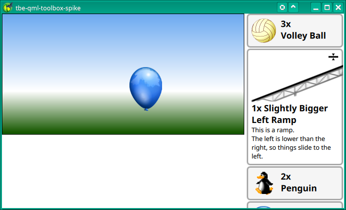
Architecture spike 2: a better toolbox
Having to first click on an object in the toolbox, and then click it again to put it in the scene and then drag it around - it’s too much.
We wanted to make it simpler - while keeping all the same info. Luckily, one of the QML examples had something that vaguely resembled what kaa-ching had in mind. It quickly turned into a full-featured toolbox. See github.com for the code. You can now drag-and-drop immediately from the small icon, or click it. It will grow to fit the full-size object and the full description. And you can drag-and-drop the larger object as well.
It turned out to be really intuitive - everyone we asked was in favour of the new approach. Oh, and scaling was implemented considerably simpler in this example. But is was even more wrong. But at least we now knew how to do it right!
We also went back to cmake, the Makefile generater used in TBE already. That felt better!
In total, kaa-ching did 5 spikes, but some were only to prove a certain approach.
Implementing the real thing: in progress!
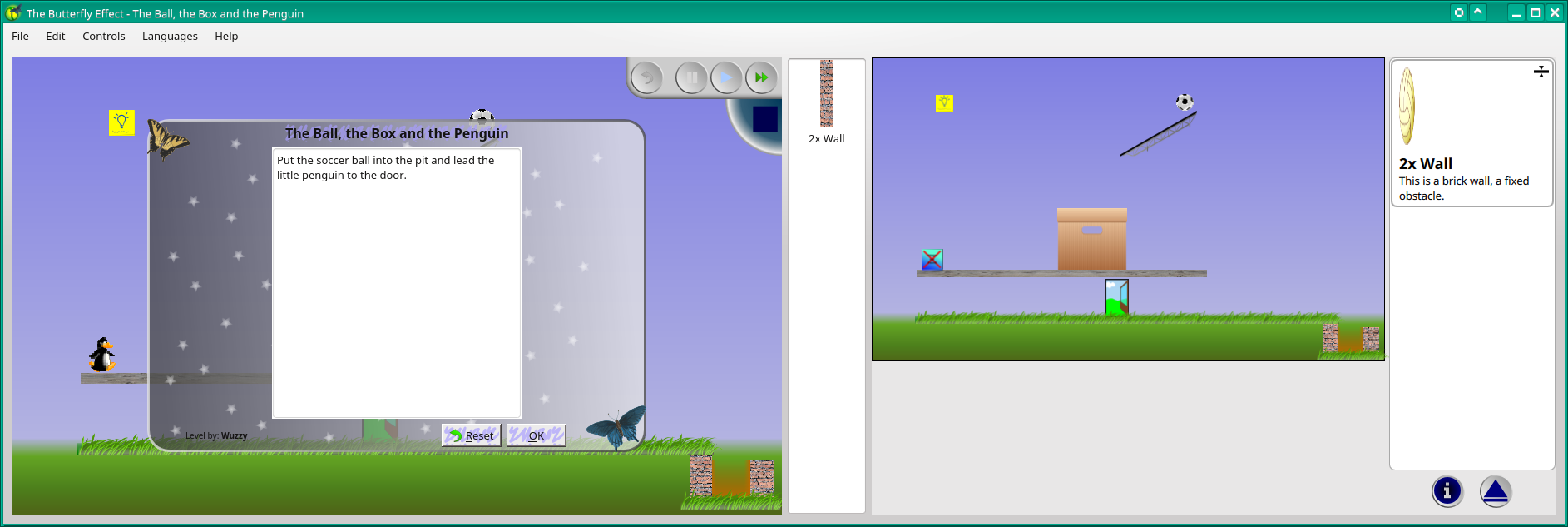
If you download and build the current git tree, you’ll see both UIs next to each other. Some things can only be done on the left, some things can only be done on the right. Be careful not to mix, or it might crash… The objects in the toolbox all resemble a Volley Ball, some objects like the penguin and the balloon are drawn as the “object not found” image. Objects added to the left only appear when you hit “play”. The good news: the new UI is so powerful, that its overhead is almost negligible. We expect that on all platforms drawing performance will improve. And as a bonus, Android will become a possibility, too!
The below image is rather wide, you’ll have to click it to see it in its full with (1885 pixels wide!).
Obviously, this is still work in progress. But we think we now got things right. Object scaling feels almost trivial - a good sign of being done right!
Unfortunately, the new UI is progressing slowly. Not in the least because kaa-ching just started a new job and had to focus there. But there’s progress, every week!
New levels
At the same time, Wuzzy has designed a few new levels. Not all of them are added to the menus yet. But it will happen later, once everything starts working again! The level above is obviously also done by Wuzzy, it’s called “The Ball, the Box and the Penguin”.
We hope you liked this update. There’s a lot going on, even if you cannot see it from the website. It will probably take until Christmas or so to complete, but the new UI is coming along. If your fingers start itching, why not try the current state yourself?
Oh, by the way, it is really Sneak Peek. Just ask the Oatmeal.
How do you like the new UI? We hope to hear from you!